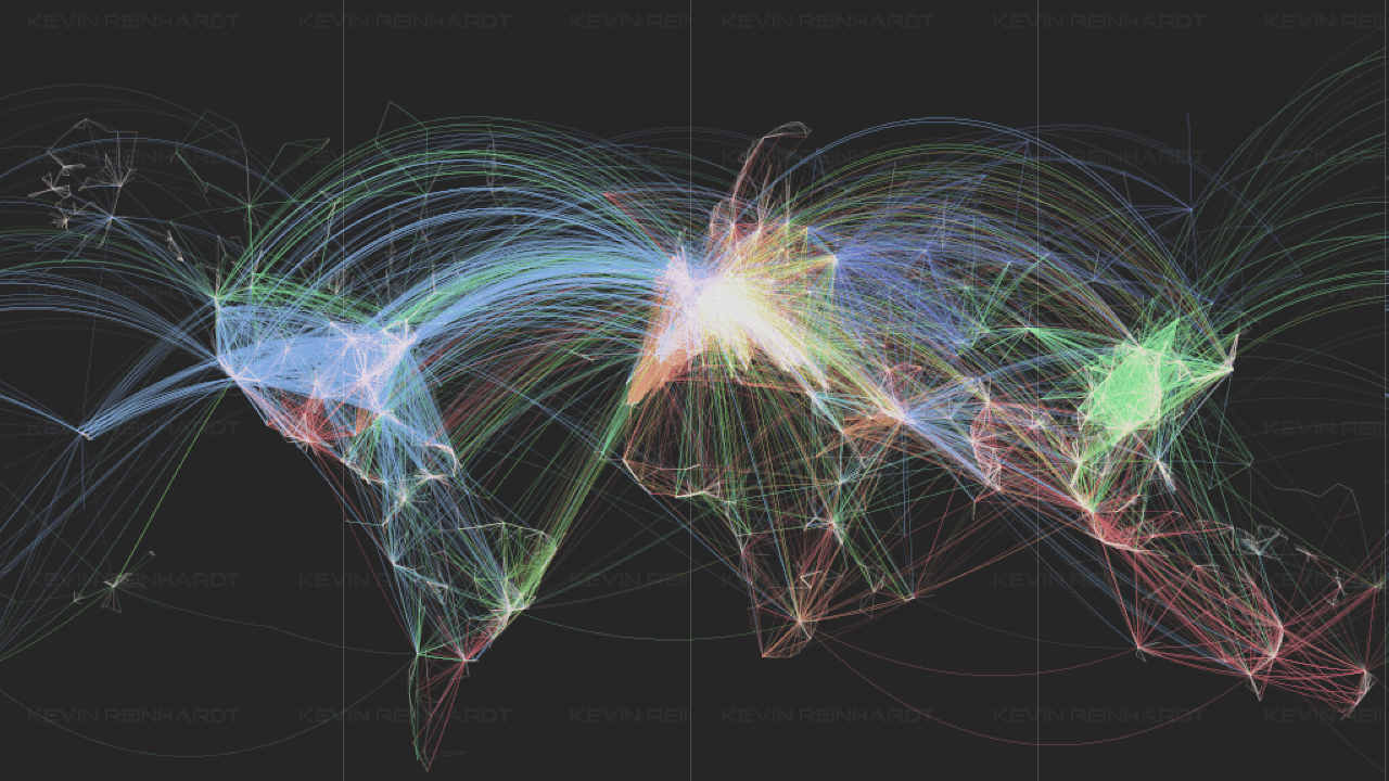
The amazing map above shows the world only using using airline flight routes. The original project dates back to 2014, but still looks incredible today.
The main things to note is that flight routes are a proxy for population density and wealth. That’s why you see lots of routes in Europe (the home of low cost airfares) and East Asia and comparatively fewer routes elsewhere.
If you enjoyed this map please help by sharing it.


 The Best Airports for Plane Spotting
Leave a Reply